The new Atlas of Disaster
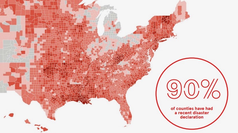
A new report published November 16, 2022, shows that 90% of the counties in the United States have met the cost threshold for a federal disaster declaration in the past decade. The report is called the Atlas of Disaster. It uses maps of the United States, showing every county, plus breakout maps for each state. The non-profit group Rebuild by Design – working with two emergency management companies, APTIM and iParametrics, and a team of engineers, researchers, finance experts, data managers, and volunteers – identified, analyzed, and synthesized different data sets to create this compendium of county-by-county disaster impacts.
The report lets you explore locations of federally declared major disasters. It also has maps showing where federal funds have gone, areas of social vulnerability and areas at greatest risk of power outages.
And it maps regions where investment in the community could help mitigate future disasters.
The U.S. Department of Housing and Urban Development first awarded funds for a Rebuild by Design nationwide competition in 2016. The funding went toward resilient infrastructure and housing projects. But the idea goes back further, to the wake of Hurricane Sandy in 2012 (300 homes destroyed, 44 people killed and an estimated $19 billion in damages and lost economic activity in New York City alone).
Are they climate disasters?
While the non-profit Rebuild by Design called the events in its new report “climate disasters,” some experts disagree that all the events in the report are related to climate. Because, from a scientific standpoint, we still can’t track the extent to which individual severe weather events are related to climate change. And as Drew Costley, reporting for The Washington Post, pointed out:
The report was prepared by policy advocates, not scientists, and oversteps in attributing every weather disaster to climate change. That is inaccurate. Climate change has turbocharged the climate and made some hurricanes stronger and disasters more frequent, said Rob Jackson, a climate scientist at Stanford University. But, ‘I don’t think it’s appropriate to call every every disaster we’ve experienced in the last 40 years a climate disaster.’
Costley also quoted Jackson as saying:
I do think there is a service to highlighting that weather disasters affect essentially all Americans now, no matter where we live.
Major events in the Atlas of Disaster
The map shown at top – and shown in more detail here – appears in shades of red, showing the locations of major disasters from 2011 to 2021. The government’s legal definition of a major disaster, outlined in the Stafford Act of 2021, is:
Any natural catastrophe (including any hurricane, tornado, storm, high water, winddriven water, tidal wave, tsunami, earthquake, volcanic eruption, landslide, mudslide, snowstorm, or drought), or, regardless of cause, any fire, flood, or explosion, in any part of the United States, which in the determination of the President causes damage of sufficient severity and magnitude to warrant major disaster assistance under this Act to supplement the efforts and available resources of States, local governments, and disaster relief organizations in alleviating the damage, loss, hardship, or suffering
caused thereby.
Interestingly, a heatwave is not considered a major disaster under this definition. Yet heatwaves are the leading weather-related cause of death.
What is social vulnerability?
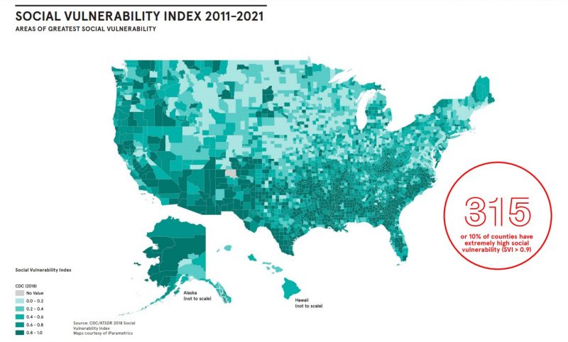
The communities identified as greatest at risk for suffering in the next crisis are those that are socially vulnerable. The green maps in the Atlas of Disaster rate the counties’ Social Vulnerability Index (SVI). The index uses 15 U.S. census variables to help local officials identify communities that may need support before, during or after disasters. Those 15 indices relate to four areas: socioeconomic status, household composition and disability, minority status and language, and housing type and transportation.
So, for example, those living in poverty, households with young children or senior citizens, households that don’t speak English or those in mobile homes or the homeless would be rated high on the SVI. And getting hit by a disaster makes these groups all the more vulnerable in the future. Plus, the report said that disasters lead to an increase in debt collections, a decline in credit scores and failing businesses.
In fact, businesses, which provide jobs to locals and services to the community, are hit especially hard after a disaster. The report said:
40% of businesses do not reopen following a disaster. On top of that, another 25% fail within one year. The study also found that 90% of businesses fail within a year of disaster if they cannot reopen within five days of the disaster.

Where you might lose power
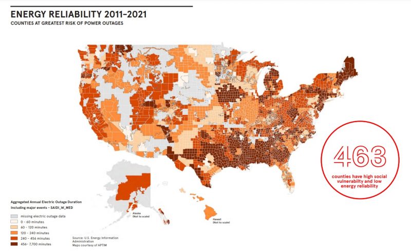
Another map category in the atlas shows regions where you’re more likely to lose power. And in a disaster, access to power is crucial. Protecting yourself against heatwaves and ice storms requires the ability to heat or cool your home. So when a disaster such as a hurricane hits, loss of power means no drinking water and limited resources to feed your family. Therefore, having a reliable energy source is important in building a resilient community when disaster strikes.

You can find U.S. maps showing where federal assistance has gone and compounding risks at Atlas of Disaster. You can also see individual maps for each state.
Bottom line: A new report shares an Atlas of Disaster, showing that over the last decade 90% of counties in the United States suffered a major disaster.
The post Atlas of Disaster shows 90% of US counties in last decade first appeared on EarthSky.
0 Commentaires